Discussion
Hi All,
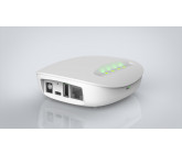
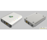
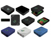
Thanks for your hard work and excellent creative designs. Congratulations to Steven INA on the winning design. The 1-4th places are 49, 70, 47, 55. I really enjoyed working with all of you and hope to work with many of you in the future.
Thanks,
InergySys
Thanks for your hard work and excellent creative designs. Congratulations to Steven INA on the winning design. The 1-4th places are 49, 70, 47, 55. I really enjoyed working with all of you and hope to work with many of you in the future.
Thanks,
InergySys

Hi All. Thanks for your patience. We had a few strong entries at the end, so I'm reviewing the designs with the team and expect to pick a winner tomorrow. Thanks!

InergySys, thanks for the compliment and for your last feedback. About the type of the contest, I’m personally in favor of a blind one because like you said it helps to apply my own style and creativity without being —consciously or subconsciously— influenced by other summations. I don’t know how others feel.
 - Mechanical Design
Thanks for the entry. The style is quite nice.
 /
/  - MyNeoDesign
Thanks again. This is a unique looking entry - we appreciate it.
 - Cup O' Design
These shapes are quite nice - especially I and II. I really enjoy looking at your design presentations. You have a nice graphics and presentation sense.
 - Alex_Muller
Thanks. Based on the picture, I'm not sure what design enhancements were made...
 - Pablo Gosso
This looks very nice. The STEP file is missing (not working) so I'm not able to see the assembly. If you see this soon, can you send it to me so we can fully review? Thanks.
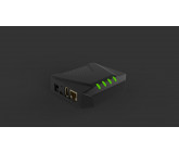
 - franznoise
Thanks for this. I didn't think that the connectors would work quite so well with a circle shape - that's an interesting throught. Nice concept.
 - Ajohnson
That's interesting how you fit the lgoo into the shape. Interesting concept... probably not what we're looking for overall.
 - Alexandar03
You did a nice job polishing this design and putting detail work in. I'm not sure it fits with the 'modern' design approach that we're looking for. I get more of an office feel than a home feel.
Thanks Cup O' Design! I'm enjoying going through the process as well. There were so many creative designs from everyone that in the end, reviewing and comparing them has become very challenging because many are quite good in my opinion. I chose to do a blind contest, but I wonder how you and the other designers feel about that approach. Does it help you build on your own brand/concept while preventing copying or reduce creativeness? I tried to give feedback that was general enough for everyone to read, but not detailed enough to completely reveal your designs. Many of you did a good job in going through the feedback because the submissions became much stronger (at least to me). I want to give thanks to arkiattack who not only submitted some nice designs, but pushed me to give additional feedback as well. It took me awhile to get comfortable doing that.
InergySys, I really enjoyed working on this contest; not only because the project itself was very interesting, but also because of the thorough feedback and information that you provided to all participants throughout the project. It was very nice and helpful. I can’t wait until all summations are visible to participants to see what others have designed; especially after reading all your comments. =)
 - Dahmoun
That is a really beautiful design. I appreciate you've put so much thought into the manufacturing, light pipes, etc as well as performing the molding analysis. I don't have any additional feedback for now. It looks good.
 - Pablo Gosso
This is a really interesting LED concept with a very clean design. Good work. We'll have a look - I don't have any additional feedback for now.
 - Adriano Ordoz Barissa
The shape is pretty good to start with. Thanks.
 - Baltanebalta
Nice product placement and good try making the LEDs visisble.
 - Baltanebalta
Thanks again - not quite the shape we're looking for - the proportions don't seem to be correct (i.e. thickness vs. base).
 - Decker
Cool shape. I appreicate all of your submissions as they're all very unique. We haven't found any that resonate just yet, but are impressed with your creativity.
 - Steven
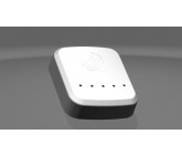
Nice work Steven. This is starting to look very refined. I don't have any additional feedback for now - thanks for continuing to make this better.
 - Pablo Gosso
You captured a lot of great details with this unit. It's pretty unique as far as designs we have evaluated go and has a retro-feel while still fitting easily into a modern home. Nice work.
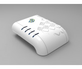
 - MILARS
Thanks for keeping at it.
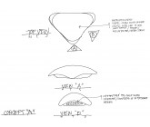
 - ACIautocadServices
That's an interesting cone... Thanks.

Please check the update of the third model that you requested.
Hi All, Thanks for the additional submissions! Feedback is below.
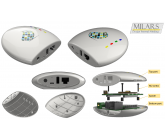
 - Pablo Gosso
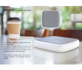
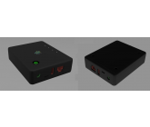
Thanks for this submission. The styling looks pretty nice. It looks pretty similar to the Samsung Smartthings V1 with front indicators. This is more-plain than some of the other designs which is good and bad. I don't have any additional suggestions for now, I'll see what others think.
 - arkiattack
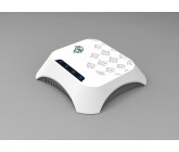
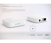
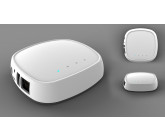
This is a nice rework of the previous designs and is much closer to what we're looking for. The height-to-base ratio seems good and it's nice that the indicators can be seen from the side and the top. The hole pattern is still nice. I'll present this to the rest of the group for additional feedback tomorrow (we have a review meeting). Thanks for keeping at it.
 - AakashP
Thanks you for submitting. This is fairly similar to the original prototype (the indicators are the same, moved to the front). I think we're looking for somthing more refined (edge detail, etc), but it's a good first shot.
- Pablo GossoThanks for this submission. The styling looks pretty nice. It looks pretty similar to the Samsung Smartthings V1 with front indicators. This is more-plain than some of the other designs which is good and bad. I don't have any additional suggestions for now, I'll see what others think.
- arkiattackThis is a nice rework of the previous designs and is much closer to what we're looking for. The height-to-base ratio seems good and it's nice that the indicators can be seen from the side and the top. The hole pattern is still nice. I'll present this to the rest of the group for additional feedback tomorrow (we have a review meeting). Thanks for keeping at it.
- AakashPThanks you for submitting. This is fairly similar to the original prototype (the indicators are the same, moved to the front). I think we're looking for somthing more refined (edge detail, etc), but it's a good first shot.
 - dushto pipra
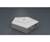
This is a neat shape for the case and goes along with the hub theme. While the design looks solid, the pentagon layout doesn't seem to be the shape we're looking for. Perahps something more square with additional edge detail.
 - Cup O' Design | Ghazale
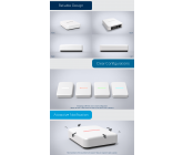
Nice work on this design especially the graphics and feedback feature. The LED bar is unique and interesting. Cables out of the back is good too. Do you have any ideas for enhancing the edge of the unit (currently rounded). They're currently rounded and we're looking for something a little more interesting. This is close to the final group.
 - Karthikeyan Arumugam
Thanks. I think we will prefer something a little more flat (less cone-shaped).
 - Flaviano Crespi
Thanks. We're reviewing your updates in 45, 46, 47. This style is a finalist right now. I don't think we have any additional changes at the moment.
 - Adriano Ordoz Barissa
Nice work on manufacturing. I could see us going very easily into production. I don't think this captures the "Google-type" home feel we're looking for, so the look isn't quite right, although the slanted surface so you can see the indicators is good along with the unit assembly/construction.
 - MILARS
Thanks again - please see the comments from 30. Overall, we'll want cables out of the back so they're hidden. The shape and slant for the LED indicators is good (so they can be seen from the font). We're going for something more similar to other smart devices (i.e. Google, Smart Things).
 - Cup O' Design | Ghazale
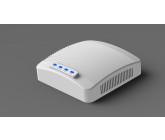
This is another great presentation. This is pretty clean, but the first impression I got was MODEM-like. I could definitely see this fitting in an office next to a computer a sleek, modern piece of equiment, however, I don't think it would fit in the kitchen. I think I prefer the 37 design with some edge enhancements.
 - Adriano Ordoz Barissa
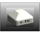
Thanks. This is getting pretty close to what we're looking for. The light pipes look good and are a nice touch. I think we'll consider this as a finalist or close to it.
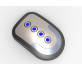
 - Adriano Ordoz Barissa
The contrast here is good along with the nice edges. The circular blue-on-back indicators pop nicely and will provide an nice impression. It's fairly basic, but effective. I think we'll consider this as a finalist/close to it as well.
 ,
, ,
, - Flaviano Crespi
The 47 design looks great and is a finalist. We'll have a deeper look at the internals over the next couple days. Thanks.
 - Saket CAD
Thanks for the updates here as well. We'll review this over the next couple days too.
 - Steven INA
Thanks for the updates here as well. This is looking good and is a finalst. I'll give you some more feedback in the next couple days after we have a chance to review in more detail.
 ,
, ,
, ,
, ,
, - Straightedge
I think you're working on some feedback for the internals now.
 - Steven INA
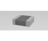
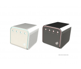
This catches the modern feel we're looking for. The edge features are nice, the overall squarish shape is nice. It's probably not going to be in the final consideration, although second to that.
 - MyNeoDesign
Very cool looking, gamer and tech-focused, not necessarily something that I can see in a modern home on the counter.
 - johrek
Thanks - we're looking for something that is a little more unique/refined.
 - Vivek Revi
You put together a very nice presentation and took into acount many details. The shape isn't quite what we're looking for (more square than this), but the design looks excellent. Maybe if the radii were reduced a bit it would be closer.
 - AlvinD
Very cool, just a bit abstract for us.
 - Karthikeyan Arumugam
This looks a little more industrial - we're looking for smoother surfaces with more squared-off features.
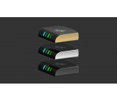
 - MILARS
This is a nice submission and I appreciate the different colors you came up with. It seems like a nice technology-focused product, but doesn't have that 'home' quality we're looking for. You've done a nice job with the manufacturing.
 - MyNeoDesign
You've got a cool style. It's a good looking design, but isn't capturing the home look we're going for.
#32 - Patil B Siddaiah
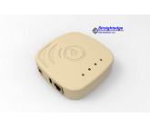
The layout is good here, lights on top, but still visible, with cables out of the back. The shape is intersting, but not what we're going for. I think we want something a bit more symmetric maybe probably preferring a lighter color as well.
 - arkiattack
This is a nice modification on the theme. Please see the comments from 11. I think overall we'd prefer something that lays flatter (less box-like). I think we're preferring designs with top-mounted LED indicators - especially if it's done so that they can be seen from the side as well.
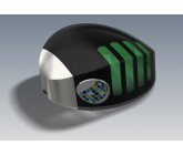
 - arkiattack
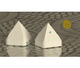
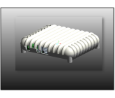
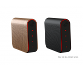
The industrial design and artistic quality here is top-notch. We do need the PCB to lay flat for the radios/antenna to work properly. The hole patterns are nice and create a nice effect. I'm not sure how manufacturing would work for this type of design - maybe you've got some ideas or experience here. I think this would make a good computer/gamer type product, but I'm not sure how it will fit in our minds for a blend-in home product. The wood grain helps with that, but the red color detracts. If this could be flattened out, curves reduced somewhat and the red switch to blue or something softer, that will be closer.
 - Steven INA
I think we prefer some of your other works a bit better - this is a bit tech-focused rather than home-focused.
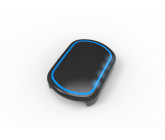 - abdillah yusuf
The design is interesting with the blue light ring and the curved surface. What's throwing us off is the rectangular shape I think. If it were a little more square/matte less, less tech and more home-focused, then we may have something.
 - Straightedge
I think we prefer some of the designs similar to 21, 22, 34
 - Steven INA
The dimensions are good, however, we prefer some of your other shapes/designs.
 - Steven INA
This was a good transition after the feedback. For all of the designs, we'll want the cables to come from the back (not the side) and the top circuit board may be updated. I think we prefer some of your other designs.
 - Dahmoun
Please see the 3/1 feedback.
 - Steven INA
You've incorporated some nice enhancements into
. We'll take a look at this over the next couple days. This is in the final running. - Saket CAD
The design updates for this in
are looking good. This is in the final running as well. - Decker
Similar comments to 5. How would LED indicators work on this? I think this is nice, just not quite the style we're looking for (not modern-home enough)
 - Artspace
Please see 2/13 Feedback.
 - Decker
Please see 2/13 Feedback.
 - Manbub
The accents and use of different colors is interesting. I think we're looking for something a little more square and aligned with common home automation productst on the market. Please have a look at the "Design Feedback" for more guidance. Thanks.
 - Dahmoun
Please see 3/1 Feedback.
 - Decker
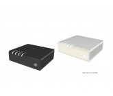
This is a nice shape. We probably wouldn't want to deliver with a transparent lid. It seems 'techy' like something you would buy for your computer, but we're going for something 'homey' that non-technical people would feel comfortable putting in their kitchen. How would/could the indicators work on something like this?
 - George Inch
Thanks. We'll need a horizontal layout for the radios to work properly. The current shape is a little abstract for what we're looking for. I think we're leaning toward something that will blend in easily to a home decor.
 - Decker
This is very cool and it does say cool. I just want to SLA it to see how it will look! Unfortuantely though it doesn't really fit the scheme we're looking for. 5 is closer to the market (less exciting, but closer).
 - Karthikeyan Arumugam
Thanks. I think we're looking for some more refinement and uniqueness with the indicators and shape.
 - Dahmoun
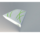
I really think this is interesting and unique. The shape is non-conventional with the curved front. The pattern on the top in the outline of the logo is interesting, so there are some very good design elements. Overall, the shape hasn't appealed in our survey, so I think we'll have to consider something a little more conventional.
 - MILARS
Nice job on addressing manufacturability. Overall, we'd prefer something that is more square than a full rounded surface and a matte finish. The LED indicators may be moved around on the board to support different feedback.
Thank you all again for the submissions. I've had a few more requests for feedback, so I'll try to touch on all the designs briefly. Please make sure to see the feedback "Design Feedback.pdf" & "Top Circuit Board Placement Guidance". If I haven't given clear feedback or you are looking for more detail, let me know and I'll try to articulate a bit better. Thanks again!
Hi Cup O'Design. I'll start sending feedback to everyone later today. Thanks!
Hi InergySys, I'm wondering if you had any thoughts towards my entries.
Thanks!
Thanks!
Thank you all for the excellent work and submissions so far. There are a few updates still in progress, so I've extended the project 5 days to allow everyone to finish and finalize our feedback.

hi!?:P

Hi InergySys,
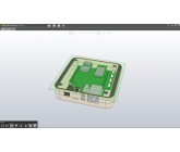
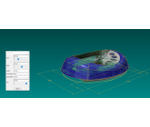
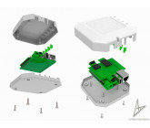
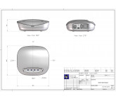
Thanks for your feed back.Yes we will send you the exploded view showing the components shortly.
Rgds,
SaketCad
Thanks for your feed back.Yes we will send you the exploded view showing the components shortly.
Rgds,
SaketCad
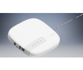
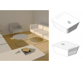
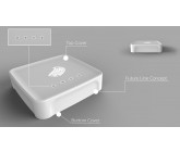
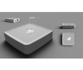
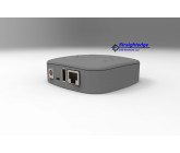
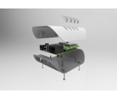
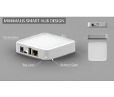
Hi Steve. We like this design as well. Can you give us an idea of what the internal design and assembly will look like? What ideas do you have for labeling (LEDs) and branding this unit? Currently, the curved surface where the connectors are mounted has gaps. What are you thinking to resolve the gaps? We'd like the cables to come from the rear of the unit (make sure when labeling/branding) that you're looking at the front with the cables going away from you. Nice work again! Thanks.
InergySys
Buyer